COVID-19 Data Dashboard
A downloadable game
Summary:
This Tableau dashboard serves as a comprehensive visualization of global COVID-19 data, providing insightful perspectives into the impact of the pandemic. Based on data retrieved in my previous SQL project (https://mortimer.itch.io/covid-19-sql-data-analysis-project), this dashboard showcases my proficiency in SQL, Tableau, and data analysis.
Insights:
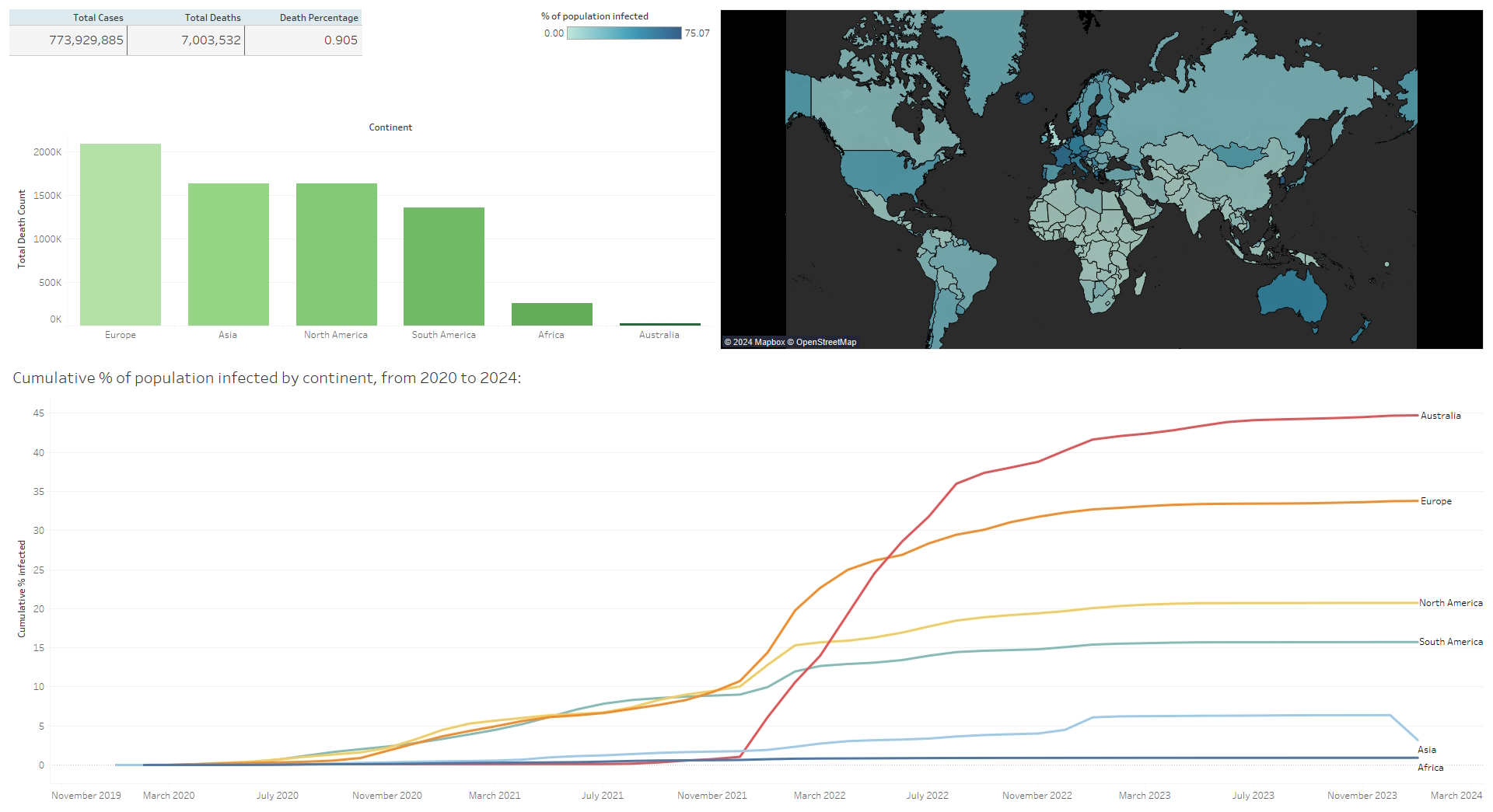
The data reveals notable disparities in infection rates across different continents, with Australia and Europe demonstrating the highest rates relative to population size. Furthermore, the analysis underscores the importance of targeted interventions and global collaboration to address ongoing challenges posed by the pandemic, as it demonstrates clear reductions in infection rate correlating with increased vaccinations.
Skills Demonstrated:
- SQL Proficiency: The dashboard relies on data extracted via SQL queries, demonstrating my ability to retrieve, clean, and manipulate data using SQL.
- Tableau Skills: The visualizations are designed and implemented in Tableau, showcasing my proficiency in creating interactive and insightful dashboards.
- Data Analysis Skills: The project goes beyond mere visualization, offering a deeper understanding of the global COVID-19 landscape through analytical interpretations.
Features:
1. Global Summary Table
- Total Cases and Deaths: A concise table displaying the total number of COVID-19 cases and deaths worldwide.
- Fatality Rate: The percentage of cases that resulted in fatalities, offering a quick overview of the severity of the virus.
2. Bar Chart of COVID-19 Deaths by Continent
- A visually appealing bar chart presenting the distribution of COVID-19 deaths across different continents.
- Provides a comparative analysis of the impact of the pandemic on a global scale.
3. Population Heat Map
- Geographical Visualization: A world map where each country is color-coded to represent the percentage of its population affected by COVID-19.
4. Cumulative Cases Over Time
- Temporal Analysis: A dynamic line graph illustrating the cumulative COVID-19 cases over time for various continents from 2020 to 2024.
Available on Tableau Public:
https://public.tableau.com/app/profile/samuel.mortimer/viz/COVID19Dashboard_1705...
Download